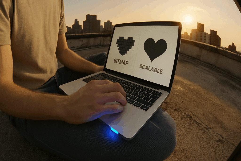
Not all digital images are created equal—and choosing wrong can cost you. Whether you’re designing a logo, building a website, or editing thumbnails for your vlog, understanding image types matters. Raster and vector are the two main formats, and confusing them is a rookie mistake.
Raster images (think JPEGs, PNGs) are made of pixels. They’re great for photos or detailed visuals, but they lose quality when you scale them up. Blow up the size, and you’ll see the fuzz. On the flip side, vector images (like SVGs) use math to draw shapes. They’re crisp at any size and ideal for graphics, logos, and anything you might need to resize later.
In short: use raster for rich visuals where detail matters. Go vector when you need flexibility and scalability. If you care about keeping your visuals sharp and your workflow smooth, this difference isn’t optional knowledge—it’s foundational.
Raster graphics are all about pixels—tiny squares that stack together to form detailed images. This format is built for depth, realism, and texture, which is why it’s the go-to for photography and detailed visuals. If you’ve worked with files like JPG, PNG, GIF, or TIFF, you’re already in raster territory.
What makes raster strong is its look. You get rich colors and smooth gradients, perfect for visuals that need to feel lifelike. But there’s a tradeoff. Scale them up, and things go south fast—blurriness, pixelation, and a general loss of sharpness. Raster files also tend to be on the heavier side when it comes to storage.
In short: great detail, not so great for resizing or saving space. Use it when you need visuals to be vivid and accurate, not scaled to infinity.
Vector graphics are built with paths, not pixels. That means they scale up or down without losing clarity, whether you’re working on a phone screen or blowing it up for a billboard. Common file types include SVG, EPS, AI, and sometimes PDF, especially in professional workflows.
The big upside? Vectors stay sharp no matter the size. You get crisp lines, clean curves, and leaner file sizes—ideal for logos, icons, and illustration work. They’re great for stuff that needs to look perfect in any format or resolution.
But they aren’t magic. Vectors struggle with realism. You won’t be using them to edit a photo or capture lifelike textures. For complex images—think high-res photography—you’ll want raster formats instead. It’s about knowing when to use which tool. Sharp, simple, and scalable: that’s the vector approach.
Micro-Niching for Loyal, High-Intent Audiences
Broad appeal is out. In 2024, the smart bet is small, focused, and fiercely specific. Vloggers are zooming way in—think niches like “budget travel for introverts” or “DIY decor for mid-century apartments.” Why? Because algorithms are favoring content that holds attention, and nothing keeps viewers locked in like content that feels made just for them.
This shift isn’t just about gaining subscribers. It’s about building loyal communities. High engagement in a tight niche often translates to better monetization—more targeted sponsors, more relevant products, more repeat viewers. A thousand niche fans who actually care beat a hundred thousand who don’t.
If you’re still trying to please everyone, this is your sign to stop. Find your angle. Own it. Get specific, stay consistent, and speak to your people. The platforms will notice—and so will your audience.
Why Vector Graphics Still Matter
Vector graphics are a timeless staple in any designer’s toolkit—and for good reason. Their scalability, versatility, and clarity make them perfect for a wide range of visual projects, from digital assets to large-scale print campaigns.
When to Use Vectors
Here’s when choosing vector graphics is a no-brainer:
-
Logos and Icons
Vectors maintain crisp edges at any size, making them ideal for brand elements that need consistency across platforms. -
Print Materials
Whether you’re creating business cards, brochures, or product packaging, vectors ensure clean, professional results every time. -
Resizing Without Quality Loss
Unlike raster images, vectors don’t pixelate. This makes them perfect for assets that need to be resized frequently across different media formats. -
Large-Format Printing
Billboards, posters, and banners benefit enormously from vector graphics, where image clarity at large scale is essential.
The Bottom Line
If you’re designing something that needs to scale effortlessly and look sharp in every context, vector graphics are not optional—they’re essential.
If you’re working with visuals—thumbnails, overlays, channel branding—start in vector. It’s lighter, cleaner, and crazy flexible when you need to scale things later. Raster graphics (think pixel-based images like JPGs and PNGs) have their place, but they lock you into a resolution and make clean edits tougher down the line.
Only rasterize when you’re at the finish line or when pixel-level detail is absolutely necessary. That includes things like photo retouching or texture-heavy assets. Until then, keep your files in vector format (SVG, AI, etc.) so you can tweak, resize, and repurpose without degrading the quality.
Smart creators keep a library of original vector assets—logos, icons, templates—so they’re never boxed in when it’s time to pivot. Stay flexible, and your visual workflow will stay fast and sharp.
The Perils of Raster for Logos and Print
Designing logos in raster format is one of the fastest ways to limit your brand’s flexibility. Raster graphics are pixel-based, meaning they’re resolution-dependent. A logo made this way might look fine on your screen, but once you try to scale it up—say, for signage or product packaging—it can break apart. You end up with soft edges, jagged lines, and a brand that suddenly looks cheap.
Still, many creators make the mistake of exporting logos for large-scale print without thinking through the format. Sending a raster image to print—especially a low-res one—is like trying to blow up a sticker to billboard size. It just doesn’t hold up. Print shops need crisp, scalable artwork. Vector is the gold standard for a reason.
Then there’s the matter of DPI (dots per inch). If you’re exporting a raster logo and ignore DPI settings, you’re setting yourself up for poor results. Low DPI equals poor print quality, no matter how good it looks on your monitor. Think 300 DPI minimum for anything going to print.
Bottom line: for logos and any brand asset that you’ll use across formats, vector is your best bet. Raster has a place—but not at the heart of your identity.
Fonts Behave Differently in Both Formats
When working across digital and print, type doesn’t always play by the same rules. A font might look clean and crisp on screen, but turn into a jagged mess in a printed PDF. That’s because rendering engines and font licenses interact differently depending on the format—and assuming consistency can wreck a layout at the last second.
The fix? Know when to embed and when to outline your text. Embedding fonts keeps them editable and sharp in most digital formats like interactive PDFs or web previews. But if you’re sending files for print—or to a client who might not have your fonts—outlining converts type to vector shapes. That locks in the look regardless of what software opens it, though it does kill editability. So outline when finalizing for print; embed when you need flexibility.
It’s low-level stuff, but it matters. A messed-up typeface can sink even the best design. Handle your text like it’s mission-critical—because in design, it is.
(Related reading: 5 Typography Rules Every Graphic Designer Should Follow)
Match the Format to Your Goals—Precision > Habit
In vlogging, format isn’t just style—it’s strategy. Too many creators fall into the trap of copying what’s popular without asking if it fits their audience, content, or goals. A 30-second reel might catch attention, but if your value lives in storytelling or tutorials, a longer format might actually serve you (and your audience) far better.
Being precise about format means asking the hard questions: What’s the purpose of this video? Who am I building it for? What action do I want from a viewer? Those answers shape everything—from length and structure to pacing and calls to action.
Used right, format can save hours of guesswork, editing streaks, and half-baked uploads. It becomes part of your creative toolkit, not a constraint. The smartest vloggers in 2024 are experimenting thoughtfully, testing short-for-deep dives, mixing live with scripted, and tuning format around what converts… not just what trends.
 Portiana Bowsery is the kind of writer who genuinely cannot publish something without checking it twice. Maybe three times. They came to software development trends through years of hands-on work rather than theory, which means the things they writes about — Software Development Trends, Expert Analysis, Graphic Design Tools and Techniques, among other areas — are things they has actually tested, questioned, and revised opinions on more than once.
That shows in the work. Portiana's pieces tend to go a level deeper than most. Not in a way that becomes unreadable, but in a way that makes you realize you'd been missing something important. They has a habit of finding the detail that everybody else glosses over and making it the center of the story — which sounds simple, but takes a rare combination of curiosity and patience to pull off consistently. The writing never feels rushed. It feels like someone who sat with the subject long enough to actually understand it.
Outside of specific topics, what Portiana cares about most is whether the reader walks away with something useful. Not impressed. Not entertained. Useful. That's a harder bar to clear than it sounds, and they clears it more often than not — which is why readers tend to remember Portiana's articles long after they've forgotten the headline.
Portiana Bowsery is the kind of writer who genuinely cannot publish something without checking it twice. Maybe three times. They came to software development trends through years of hands-on work rather than theory, which means the things they writes about — Software Development Trends, Expert Analysis, Graphic Design Tools and Techniques, among other areas — are things they has actually tested, questioned, and revised opinions on more than once.
That shows in the work. Portiana's pieces tend to go a level deeper than most. Not in a way that becomes unreadable, but in a way that makes you realize you'd been missing something important. They has a habit of finding the detail that everybody else glosses over and making it the center of the story — which sounds simple, but takes a rare combination of curiosity and patience to pull off consistently. The writing never feels rushed. It feels like someone who sat with the subject long enough to actually understand it.
Outside of specific topics, what Portiana cares about most is whether the reader walks away with something useful. Not impressed. Not entertained. Useful. That's a harder bar to clear than it sounds, and they clears it more often than not — which is why readers tend to remember Portiana's articles long after they've forgotten the headline.